Custom Tee Artwork Submission Guide
The most important part of your custom tee is the design. That’s what makes your personalized t-shirt uniquely yours. For this reason, it’s especially essential that you make sure the artwork is properly prepared for printing. Otherwise, the final product might not look like what you imagined. This guide will provide you a few tips for making sure your design is ready to wear.
General Artwork Submission Guidelines
We will need a digital version of your design that follows these simple guidelines:
-
File Format:
- Vector Files: EPS, SVG, AI, PDF
- Raster Files: PSD, TIF, PNG, JPG, PDF
-
Resolution:
-
at least 300 DPI at the size you wish to be printed
- Example: 300 DPI at 11 x 8.5 inches
-
at least 300 DPI at the size you wish to be printed
-
Colors:
- For Screen Printing: 8 or fewer colors
- For Heat Transfer Vinyl: 4 or fewer colors
- For Direct to Garment (DTG): Unlimited colors
We prefer vector files when you submit your design to use for printing, but a raster file will work if the resolution is high enough.
Generally, if you submit to us a raster file, such as a JPG or PNG, we will have to convert it to a vector file anyway using our specialized software. If the artwork is a high quality, high resolution image, it shouldn’t be much of an issue, but lower quality designs need time to be cleaned up.
Approving Artwork
Once we have readied your design for print, we will send you an Artwork Proof as an example of what the final printed shirt should look like. You must approve of this before we can begin printing. We try our best to make sure everything is correct, and once the print production process has started, we can’t change anything! So it’s imperative that you go over the proof, ensuring everything is spelled correctly and in the right place.
Color Tips
Please keep in mind that there is a color limit for most printing processes. For screen printing, the limit is 8 colors, while heat transfer vinyl has a limit of 4 colors. If you really want to use unlimited colors, and have a really complex, high-detailed design, our Direct to Garment printing service will be the way to go.
Take into consideration what color shirt you intend to print on. Black text printed on a dark blue shirt won’t be very legible unless you add a bright outline to it. Just because it might look okay on your computer monitor doesn’t necessarily mean it will look good on the print.
Color Accuracy
A very important note is that the colors on your computer screen may not exactly match up with the colors printed on the t-shirt. The reason for this is that the colors on your computer monitor are displayed through an RGB color spectrum while printed materials are created with CMYK. For a more accurate representation of your printed colors on your computer screen, make sure to set your design software to display in a simulated CMYK environment. Please also note that PNG is an RGB-only file format, so if you want to retain a transparent background in your CMYK design, you’ll have to save in a format such as PSD, PDF, or TIF.
Vector vs Raster
A vector file is a graphics file that can be scaled to any size without losing quality. The reason for this is that that vector graphics are actually all just data and math. The computer can just recalculate the size of the image and automatically redraw it using those calculations. Vector graphics can be created in programs like Adobe Illustrator. They usually can be saved in AI, SVG, and EPS file formats.
If you’ve downloaded a picture off the Internet, it’s likely a raster image file. A raster file is a graphics file that is made up of pixels. These pixels are fixed elements of the image, so if you resize the image, it has to add extra pixels that don’t actually exist, which almost always results in a blurry or pixelated image. So, if you’re working with a raster format, it’s best to start off with as many pixels as you can because reducing the image’s size and keeping its quality is a lot easier than enlarging it.
The number of pixels in a raster image is known as that image’s “resolution.” We prefer high resolution images, so the minimum resolution for a raster image is around 300 DPI at the size of your intended print. Images you find online tend to be at around 72 DPI, so if you want to DTG print a photo off your Facebook onto a t-shirt, try and find the original, high-resolution version of the photo. Raster images can be saved in normal web-friendly formats like JPG and PNG.

A Vector graphic when enlarged will retain its image quality, while a Raster graphic will become blurry and pixelated.
Vector Image Tips
If you’re submitting your design in a vector format, you’re usually good to go. However, there are a few special considerations to take into account before sending us your design.
Outline Your Fonts
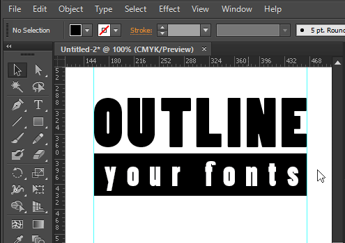
So you’ve discovered a super cool font for your design and you want to put it on a t-shirt. That’s awesome, but what’s going to happen if we don’t have the same font file when we print your design? It probably wouldn’t be anything that you would like.
To prevent that potential tragedy, make sure you outline your text in your vector program of choice. By converting your text into outlines, the text will remain the way it is regardless of whether or not the printer has the same font.
In Illustrator, all you have to do to outline your font is click on your text, click to “Type” on the menu bar, and select “Create Outlines” and then “Save” your file. This will convert your text to an outline, readying it for us to print.
Raster Image Tips
Resolution
We’re talking about resolution again because it is very important! If you submit a raster image for printing, we will need it in a high resolution to guarantee optimal print quality. Ideally that is a minimum of 300 DPI at the size you need printed.
So what does that mean exactly? Well, just because an image is 300 DPI doesn’t mean that it’s ready to print. If it’s 300 DPI at 2-inches by 3-inches, it still won’t be big enough to print at 11-inches if that’s the size you need. Make sure that your image is at the right resolution at the right dimensions.
If your image was not originally at 300 DPI, you can’t simply change the resolution to meet the higher resolution requirement. You will have to design your image at 300 DPI from the start. This is why Vector graphics are so much easier to work with, since you can resize those files without losing any detail.
Transparency
When submitting a t-shirt design, you have to keep in mind the background of your design. You’ll usually want your design’s background to be transparent; otherwise you’ll end up with your design printed with a giant white block on your t-shirt.
If you’re submitting a raster image, make sure you’re saving it in a file format that supports transparency. This is normally something like a PNG, TIFF, or PSD file. If you save your file as a JPG, it will not have a transparent background, and the design will have to be edited to delete the opaque background and exported into a different file format.
Another thing to keep mind with regards to the transparency is that only the background should be transparent. If you have any colors in the design that you intend to be translucent at an opacity lower than 100%, it will not show up as intended in the final printed design. So make sure to use your colors at full opacity when creating your artwork.
Creative Tips
That’s enough of the technical stuff for now, so let’s move on to the fun stuff: actually coming up with your design.
Draw Something!
It can be a daunting task to come up with a unique design from scratch. Staring at a blank canvas is probably the first big roadblock of the process. The solution to this is easy: just draw something. Sketch it out. You probably won’t be 100% satisfied immediately, but you’ll have something to iterate on to eventually reach that point. Like any artist, you’ll probably have about a thousand different versions of your design by the end, but that’s what being an artist is all about!
Take a Break
If you’ve really hit a wall, take a break. Refresh your mind. Go to sleep. Think about something else. Inspiration can hit you and the strangest times. Return to your canvas with a fresh perspective.
Learn Stuff!
Even if you are not a technically skilled artist, there are plenty of resources out there to help you to learn technique. Like, if you don’t know how to use Illustrator or want to know how to achieve a specific effect in Photoshop, there are numerous free tutorials online to follow along and get you where you want to go. YouTube tutorials in particular are very effective at demonstrating techniques (if you have the patience to skip through the unnecessarily long intro sequences).
Picking a Color Scheme
Maybe that 4-color limit is getting you down and you’re having trouble selecting what colors should go in your design. Well, that’s a good opportunity to implement a little bit of color theory! This begs the introduction of the color wheel, a tool that’s been used for centuries to explain relationships between different colors.
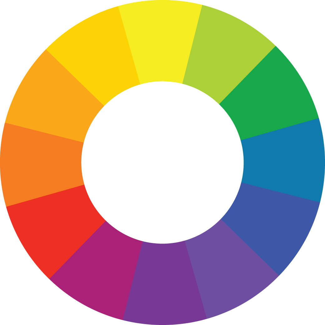
The color wheel is an oh-so-important tool for any artist.
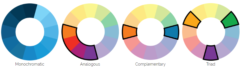
Adobe Color CC is an excellent free online tool for coming up with color schemes that follow these rules.If you want a subdued design, you can go for a monochromatic (one hue, but differing shades of it) or analogous color scheme (colors adjacent to each other on the color wheel, like the range from Orange to Purple). If you really want it to pop, go for complementary colors (colors opposite each other on the color wheel, like Orange and Blue) or a triad (three colors equidistant from each other on the color wheel, like Green, Orange, and Purple).
It can be kind of confusing at first, but you’ve got a whole rainbow to play with. Eventually you’ll get the hang of it, and suddenly you’ll start noticing common color schemes EVERYWHERE. Like, did you ever notice how basically every action movie poster out there has a complementary color scheme of orange and blue? Well, now you will notice, and I’m sorry!
Don’t limit your color theory to just your artwork. Think about what color shirt you want to print on, too, to make your design really stand out.
Just remember that the colors on your computer screen will slightly differ from those that we print with. We will work with you to best match the colors of your original design.
Typography Tips
 Sometimes your design could just solely be text, which means your font choice is directly tied to the message you’re trying to send.
Find a Functional Font
You usually want to achieve a certain tone with your design. The font choice will play a big part in that. You usually don’t want to present a shirt that says, “I love you” in a creepy, blood-spattered font. You might want the observer to feel calm or excited or frightened, and there’s usually a font that conveys exactly the emotion you want.
A script or handwriting-like font often sends a playful message, especially in all lowercase, while big block letters in all caps makes for a bold, in-your-face attitude. Sans serif fonts almost always look stylish and modern. Calligraphic fonts can add an air of sophistication.
Don’t overdo it with too many styles, though. Generally stick between 1 to 3 different fonts.
If you want to avoid confrontation from outspoken typography nerds, try to stay away from the common fonts like Comic Sans and Papyrus. Using those fonts get them all worked up for some reason!
Legibility is Lovely
A person actually being able to read what’s on your shirt is a pretty good start for a successful design. Some more abstract or script-like fonts might take the viewer a while to decipher what it actually says, making for an ineffective message. On the other hand, a basic serif font might be too plain. Strike a good balance between style and readability. Consider situations such as a reader possibly confusing a lower case “L” for a capital “I” or the numeral “1.”
You can get all fancy with the placement of your text, like shaping your text in certain ways, placing it vertically on the page, or having the letters cascade downwards. You can make your shirt really unique with these techniques, just don’t go overboard! Take into consideration how a viewer’s eye might move through the design. Unless you’re writing in Japanese, try to keep your text reading from left to right, and don’t let the reader potentially read the words out of order (unless that’s the intent of your design).